We’re excited to release some changes to the Editorially design today, and thought we’d take a minute to share some background on why and how we made them.
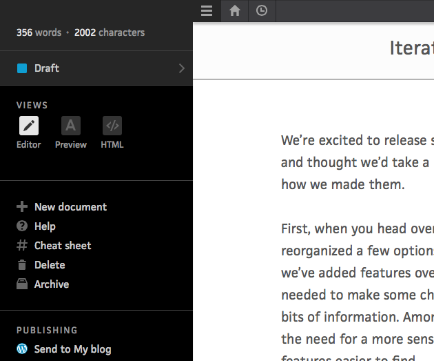
First, when you head over to the editor, you’ll notice we’ve moved and reorganized a few options and that some of the icons have changed. As we’ve added features over the past few months, it became clear we needed to make some changes to how we grouped various actions and bits of information. Among the primary reasons for these changes was the need for a more sensible organizational structure that would make features easier to find.

Previously, many common actions (like exporting or deleting a doc) were accessible from within a dropdown menu. But dropdowns are problematic on touch devices (such as an iPhone or iPad), and can be fidgety even when used with a mouse or trackpad. The new side menu is more accessible and less fragile across different devices.
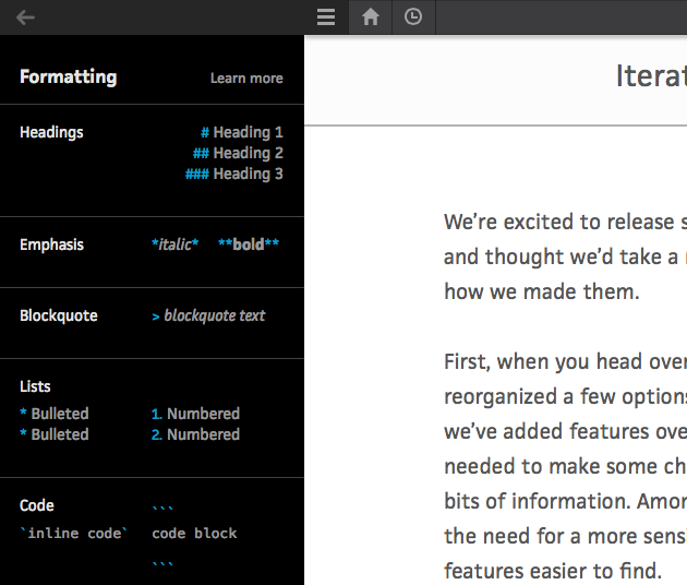
The side menu also enables us to make good on a couple of common user requests, namely, that we make word and character count and the cheat sheet available to writers as they are working. On larger screens, you can keep the side menu open while you write.

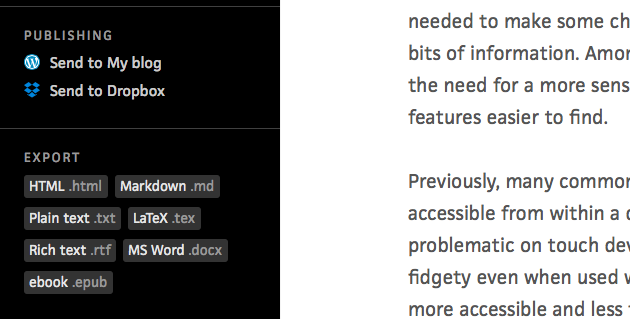
We’ve also made it faster and easier to access export and integration options. And this new layout means we can expand those options down the road without worrying about how they’ll fit into the UI.

And we’ve taken this opportunity to visualize the various “view” options. Now the editor, preview, and HTML views have accompanying icons that reinforce them.

Finally, all of these changes give us room to grow: we now have a more sensible organization, in a design that’s easier to use and more accessible across a range of devices, and with space enough to expand and provide more functionality while staying true to the minimal, clutter-free writing environment we’ve always promised.
Of course, if you have any questions or feedback for us about these changes, we’d love to hear from you at support@editorially.com.
